An Epidemic Curve, commonly referred to as an epi curve, is a visual tool used in epidemiology to represent the onset and progression of an outbreak. By graphing the number of new cases over time, public health professionals can analyze the characteristics of an epidemic, such as its source, timing, and mode of transmission. Epi curves are a critical component in outbreak investigations, providing a straightforward yet powerful way to interpret how diseases spread and identify when interventions should occur.
In this Epi Explained, we’ll dive into what epi curves are, the different types, how they are interpreted, and why they are crucial for public health decision-making.
Key Questions
What does an epi curve show?
An epi curve shows the number of new cases of a disease over time. By examining this curve, epidemiologists can identify patterns such as when an outbreak started, how it is progressing, and whether the disease is spreading through a common source or via person-to-person transmission.
What are the three main types of epi curves?
The three main types of epi curves are:
Point Source Outbreak: A sharp rise and fall in cases, indicating a single source of exposure.
Continuous Common Source Outbreak: A gradual, flat curve indicating ongoing exposure to the same source.
Propagated Outbreak: Multiple peaks, showing successive waves of person-to-person transmission.
How do public health officials use epi curves?
Epi curves help public health officials understand the timing, spread, and source of an outbreak. They are used to track disease progression, assess intervention effectiveness, and predict future cases.
What are the limitations of epi curves?
Some limitations of epi curves include data quality issues, challenges in interpretation without additional data, and complexity in cases where multiple sources or transmission methods are involved in an outbreak.
What Are Epi Curves?
An epidemic curve (epi curve) is a type of histogram that visualizes the number of new cases of a disease or health condition over time. The x-axis represents time (e.g., days, weeks, or months), while the y-axis shows the number of cases. By tracking cases across time, epi curves help epidemiologists and public health officials understand how an outbreak evolves, allowing them to identify its potential source, mode of transmission, and peak period.
Epi curves are especially useful during infectious disease outbreaks but can also be applied to other public health events, such as foodborne illnesses, chemical exposures, or natural disasters.
Why Are Epi Curves Important?
Epi curves provide several key insights during an outbreak:
Understanding the Timing of an Outbreak: Epi curves illustrate when cases start, peak, and decline, allowing public health officials to identify the onset of an outbreak and how quickly it progresses.
Determining the Source of Exposure: By examining the shape of the curve, epidemiologists can infer whether the outbreak was caused by a single source (point source), continuous exposure, or propagated transmission (person-to-person spread).
Assessing the Effectiveness of Interventions: Public health interventions, such as quarantine measures, vaccinations, or public education campaigns, can alter the shape of the epi curve. A drop in cases after an intervention indicates its potential success.
Predicting Future Cases: Based on the pattern of the curve, public health professionals can estimate how many more cases may occur and how long the outbreak will last.
Components of an Epi Curve
To interpret an epi curve effectively, it’s essential to understand its core components:
X-Axis (Time): The horizontal axis represents time, typically in units like days, weeks, or months, depending on the outbreak’s duration. This axis shows when cases occurred. It should be noted that as the dynamics of an outbreak change, it’s possible that the best time scale for representing that outbreak may also change to better inform operations or the public.
Y-Axis (Number of Cases): The vertical axis shows the number of cases (or other health events) occurring within each time period.
Bars or Columns: Each bar on the graph represents the number of new cases during a specific time period. By looking at the height of the bars, epidemiologists can assess the rise and fall of cases.
Example of an Epi Curve in Action
Imagine an outbreak of a foodborne illness, such as salmonella. The epi curve shows when the first cases were reported and tracks the spread of the illness over time. If the cases spike quickly and then decline just as rapidly, it suggests a point-source outbreak, where all individuals were exposed to the pathogen around the same time (e.g., at a contaminated restaurant who got a bad batch of an ingredient). If cases rise more gradually and stay elevated over a longer period, it may indicate ongoing exposure or person-to-person transmission.
Types of Epi Curves
There are several types of epi curves, each representing different outbreak patterns:
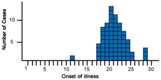
Point Source Outbreak: In a point source outbreak, individuals are exposed to the same source of infection at the
An example of a Point Source Outbreak Epi Curve. (Source: CDC)
same time. The epi curve for a point source outbreak typically shows a sharp rise in cases, followed by a gradual decline. An example would be a food poisoning incident where individuals who ate contaminated food develop symptoms within a few hours or days of exposure.
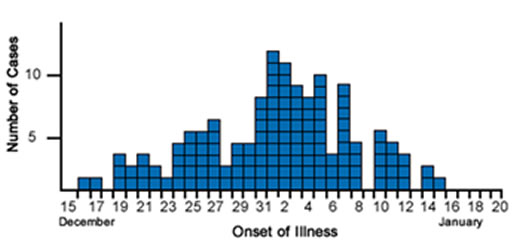
Continuous Common Source Outbreak: In a continuous common source outbreak, individuals are exposed to the infectious agent over a longer period.
An example of a Continuous Common Source Outbreak Epi Curve. (Source: CDC)
The epi curve tends to be flat, as new cases continue to occur as long as the source remains active. For example, contaminated water in a community may cause new cases of illness to appear regularly until the water source is cleaned or shut down.
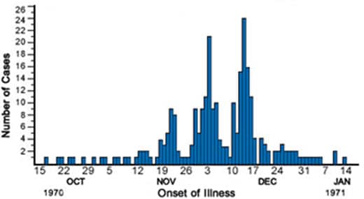
Propagated Outbreak: In a propagated outbreak, the disease spreads from person to person, leading to successive “waves” of cases.
An example of a Propagated Outbreak Epi Curve. (Source: CDC)
The epi curve for a propagated outbreak shows multiple peaks, each corresponding to a new generation of transmission. This pattern is commonly seen with highly contagious diseases like measles or the flu.
Visual Comparison of Epi Curves
Point Source Curve: The curve rises sharply and then falls, resembling a peak. This suggests that many people were exposed at once, and the outbreak was brief.
Continuous Source Curve: The curve is more gradual and flat, as new cases arise over time due to ongoing exposure.
Propagated Curve: The curve shows a series of peaks, with each new peak representing a subsequent wave of infections due to human-to-human transmission.
How to Interpret an Epi Curve
Interpreting an epi curve requires considering several factors:
Shape of the Curve: The shape of the epi curve provides clues about the type of outbreak. A sharp peak suggests a point source, while a flat curve with sustained cases suggests continuous exposure. Multiple peaks suggest propagated transmission.
Time of Onset: The date when cases first appear on the curve indicates when the outbreak likely started. For infectious diseases, this information helps estimate the incubation period, which is the time between exposure and the onset of symptoms.
Peak of the Outbreak: The highest point on the curve represents the peak of the outbreak, where the most cases occurred in a given period. Identifying the peak helps gauge when the outbreak was at its worst and when it might start to decline.
End of the Outbreak: The point where the curve returns to baseline (i.e., when no more new cases are reported) indicates the end of the outbreak. If the curve doesn’t return to baseline quickly, it may signal ongoing transmission or incomplete containment efforts.
The Role of Epi Curves in Outbreak Investigations
Epi curves are indispensable in the field of outbreak investigations. When a disease outbreak occurs, public health officials need a rapid and reliable way to understand how the outbreak is unfolding and where to intervene. Epi curves offer a real-time visualization of case progression, helping investigators to:
Determine the source of infection: By pinpointing the earliest cases and understanding the shape of the curve, epidemiologists can trace the source of exposure (e.g., contaminated food, infected individuals, or environmental hazards).
Identify the mode of transmission: The shape of the curve can reveal whether the disease is spreading through contaminated sources (point or continuous exposure) or through person-to-person contact (propagated transmission).
Evaluate the impact of interventions: As public health interventions, such as vaccination campaigns or quarantine measures, are implemented, the shape of the epi curve may change, indicating the effectiveness of these strategies.
Limitations of Epi Curves
While epi curves are valuable tools in public health, they have some limitations:
Data Quality: The accuracy of an epi curve depends on the completeness and timeliness of the data. Delays in reporting or incomplete case data can lead to a distorted view of the outbreak’s progression. During normal outbreak investigations and response, data quality will often be uncertain, so using best practices and what is available is generally accepted.
Interpretation: Epi curves alone cannot provide conclusive evidence about the cause of an outbreak. Additional epidemiological data, such as patient interviews, laboratory tests, and environmental assessments, are often needed to confirm the source of the outbreak.
Complex Outbreaks: In outbreaks with multiple sources or varying transmission modes, the epi curve may be difficult to interpret, as it might show overlapping patterns that don’t fit neatly into the standard outbreak types (point source, continuous, propagated).
Conclusion
An epidemic curve is a vital tool in epidemiology, providing a visual representation of how a disease outbreak progresses over time. By tracking the number of new cases across time intervals, public health professionals can identify the source of the outbreak, determine how the disease is spreading, and assess the effectiveness of interventions.
Although epi curves cannot explain everything about an outbreak, they are an essential starting point for public health investigations and are often used in conjunction with other epidemiological tools to uncover the root causes of disease outbreaks and inform public health actions.
Humanities Moment
The featured image for this installment of Epi Explained is Winter’s Cabin at the Curve by Birge Harrison (American, 1854–1929). Lovell Birge Harrison was an American landscape and genre painter, teacher, and writer, known for his advocacy of Tonalism. Born in Philadelphia, he studied under Thomas Eakins, Carolus-Duran, and at the École des Beaux-Arts, becoming one of the first American artists to have work purchased by the French government. Harrison, influenced by atmospheric painting techniques, became a leader of the Tonalist school after moving to Woodstock, New York, where he founded a painting school. He was a celebrated artist and writer, receiving numerous accolades and publishing influential works on landscape painting, emphasizing honest observation of nature.
Thank you for reading this Epi Explained. If you’d like to learn more about epidemiology, public health, programming or other key topics, please check out more of our website!
Epi Explained: What are Non-Pharmaceutical Interventions (NPIs)?
Epi Explained: What are Non-Pharmaceutical Interventions (NPIs)?
Non-Pharmaceutical Interventions (NPIs) are actions, apart from medical treatments like vaccines and medications, that individuals and communities can take to help slow the spread of contagious diseases. NPIs are crucial during outbreaks and pandemics, especially when vaccines or treatments are unavailable, limited, or ineffective against the disease. These interventions include strategies such as social distancing, mask-wearing, quarantine, isolation, travel restrictions, and personal hygiene practices, all designed to reduce human-to-human transmission.
In this EpiExplained, we’ll cover the various types of NPIs, factors to consider when implementing them, the concept of social fatigue, and historical examples of NPIs in action.
Key Questions
What are Non-Pharmaceutical Interventions (NPIs)?
Non-Pharmaceutical Interventions (NPIs) are measures that individuals and communities can implement to reduce the spread of infectious diseases without the use of medical treatments such as vaccines or medications. Examples include hand hygiene, social distancing, mask-wearing, and quarantines.
Why are NPIs important during an outbreak?
NPIs are critical in controlling disease transmission, especially when vaccines or treatments are not yet available, or during the early stages of an outbreak. They help reduce the number of cases, protect healthcare systems, and limit the spread of the disease.
What factors influence the success of NPIs?
The success of NPIs depends on factors such as timing, public compliance, economic impacts, and the effectiveness of communication from health authorities. Cultural attitudes and access to resources also play a role in how well NPIs are adopted.
How can social fatigue affect NPIs?
Social fatigue occurs when individuals become tired or frustrated with prolonged restrictions, such as social distancing or mask-wearing. This can lead to reduced compliance and increased disease transmission, making it important to manage public expectations and offer support.
Can NPIs completely stop an outbreak?
NPIs can slow the spread of a disease and reduce its impact, but they are often most effective when used in combination with other public health measures, such as testing, contact tracing, and vaccination campaigns once available.
What are Non-Pharmaceutical Interventions (NPIs)?
Non-Pharmaceutical Interventions (NPIs) are measures that reduce the spread of infectious diseases without the use of pharmaceuticals, such as vaccines or antiviral medications. These interventions are often implemented to delay the spread of a disease, reduce the peak burden on healthcare systems, and protect high-risk populations. NPIs are particularly important during the early stages of an outbreak when medical countermeasures may not yet be available or widely distributed.
NPIs are not one-size-fits-all solutions. Their effectiveness depends on the type of disease, how it spreads, the population’s characteristics, and the timing and stringency of the interventions. In this article, we’ll explore the different categories of NPIs, key considerations for implementing them, their societal impact, and examples of their use throughout history.
Categories of NPIs
NPIs are generally categorized into three main types: personal protective measures, community-level measures, and environmental measures. Each category targets a different level of disease prevention, from individual actions to widespread societal changes.
1. Personal Protective Measures
Personal NPIs are actions that individuals can take to reduce their risk of contracting or spreading a disease. These are the first line of defense and are typically the most straightforward to implement, although their effectiveness can vary based on individual compliance.
Key Personal NPIs:
Hand Hygiene: Frequent handwashing with soap and water, or using alcohol-based hand sanitizers, is one of the simplest and most effective ways to prevent disease transmission, especially for respiratory and gastrointestinal infections.
Respiratory Etiquette: Covering coughs and sneezes with a tissue or the inside of the elbow reduces the spread of droplets that may carry viruses or bacteria.
Face Masks: Wearing masks, particularly in crowded or enclosed spaces, can help reduce the transmission of respiratory droplets and protect both the wearer and others.
Self-Isolation: Individuals who are symptomatic or have been exposed to a known case of the disease can self-isolate to prevent spreading it to others.
Effectiveness of Personal NPIs:
Personal NPIs rely heavily on individual compliance and can be influenced by public perception, education, and access to resources. For example, proper mask-wearing requires both the availability of masks and correct use.
2. Community-Level Measures
Community NPIs involve larger-scale actions that affect groups of people or entire communities. These measures are usually coordinated by public health authorities or governments and aim to reduce opportunities for close contact and large gatherings, where transmission can easily occur.
Key Community-Level NPIs:
Social Distancing: Maintaining physical space between individuals (typically 6 feet or more) reduces the likelihood of transmitting infectious diseases, particularly airborne or droplet-spread pathogens.
Quarantine and Isolation: Quarantine separates individuals who have been exposed to a disease but are not yet symptomatic, while isolation separates those who are already sick from healthy individuals.
School Closures: Temporarily closing schools can help reduce the spread of infections among children, who are often efficient disease transmitters. School closures also reduce transmission between households.
Remote Work Policies: Encouraging or mandating remote work for non-essential workers reduces the number of people commuting and congregating in workplaces, which helps lower transmission rates.
Event and Gathering Restrictions: Limiting the size of public gatherings, or canceling mass events, can prevent large-scale outbreaks, particularly in enclosed or crowded environments.
Travel Restrictions and Border Controls: Restricting non-essential travel and implementing health checks at borders can slow the spread of diseases, especially those that may be imported from other regions. This can include closing off international borders, provincial borders, or sometimes even small scale communities. This is often seen as a last option due to its impact on the communities in question, and referred to as Cordon Sanitare (French: sanitary cordon).
3. Environmental Measures
Environmental NPIs focus on modifying physical spaces to reduce the spread of disease. These interventions often involve changes in infrastructure or environmental sanitation to limit transmission in shared environments.
Key Environmental NPIs:
Enhanced Cleaning and Disinfection: Increasing the frequency of cleaning and disinfecting high-touch surfaces (e.g., door handles, elevator buttons) in public spaces, schools, workplaces, and transportation systems can reduce the transmission of pathogens.
Ventilation Improvements: Improving indoor ventilation by opening windows, using air filtration systems, or modifying heating, ventilation, and air conditioning (HVAC) systems can help disperse infectious particles and lower the risk of airborne transmission.
Physical Barriers: Installing physical barriers, such as plexiglass shields, in areas where maintaining physical distance is difficult (e.g., retail counters) can help prevent direct contact between individuals.
Building Modifications: Creating one-way pedestrian traffic flows, widening walkways, and redesigning shared spaces can reduce close contact in places where people congregate.
Factors to Consider When Implementing NPIs
While NPIs are essential tools in controlling the spread of infectious diseases, their implementation requires careful consideration of various factors to ensure their effectiveness and minimize unintended consequences.
1. Timing and Stage of the Outbreak
The timing of NPI implementation is critical. Early intervention often yields the best results in controlling disease spread. However, if implemented too late, NPIs may not significantly affect the outbreak’s trajectory.
Early Implementation: Introducing NPIs at the beginning of an outbreak can “flatten the curve,” slowing the disease’s spread and preventing healthcare systems from being overwhelmed.
Delayed Implementation: Waiting too long to implement NPIs can lead to rapid disease transmission and an explosive increase in cases, making it harder to control the outbreak.
2. Compliance and Public Perception
The success of NPIs depends largely on public adherence. Factors that influence compliance include:
Public Trust: Trust in public health authorities and government recommendations is crucial. Clear, consistent, and transparent communication fosters compliance. It should be noted that often times, the public views the actions of any government agency as “The Government”, so being cognizant of not only what your agency is doing, but of those who can be grouped in with you is essential. Often times, being able to have good relationships with community leaders can help increase public trust, but takes time and should be prioritized in a so-called Blue Sky (normal/day-to-day) environment, and not be undertaken only after something has occurred. Failure to do so can often reinforce the image of “outsiders” coming in to tell communities what to do and taking away rights, even if the intent is purely to save lives and decrease impacts of disease.
Cultural Norms: Cultural attitudes toward certain interventions, like mask-wearing or social distancing, can affect how well NPIs are adopted. In some cultures, wearing masks in public has long been normalized, while in others, it may be viewed with skepticism or resistance.
Access to Resources: Ensuring that individuals have the necessary resources to comply with NPIs is vital. For instance, hand hygiene requires access to clean water, soap, or hand sanitizers, and mask mandates require widespread availability of masks.
3. Economic and Social Considerations
NPIs, especially community-level and environmental interventions, often have economic and social implications that need to be weighed against their public health benefits.
Economic Impact: Measures like business closures, travel bans, and remote work mandates can have significant economic consequences, particularly for industries reliant on physical interaction, such as hospitality, tourism, and retail. However, this should always be considered alongside the very real cost in human lives of prioritizing business interests over appropriate NPI implementation.
Equity Issues: Some NPIs may disproportionately affect certain populations, particularly low-income communities, essential workers, and those without access to healthcare or paid sick leave. Governments must ensure that vulnerable groups are supported during NPI implementation, such as providing financial aid, social services, adequate protective equipment, etc.
Educational Disruptions: School closures, while effective in controlling outbreaks, can disrupt learning, particularly for students in disadvantaged communities who may lack access to online education or resources.
Social Fatigue and NPI Sustainability
What is Social Fatigue?
One of the key challenges of long-term NPI implementation is social fatigue. As NPIs, such as social distancing, mask-wearing, and travel restrictions, remain in place for extended periods, individuals and communities may experience psychological and emotional fatigue. This can lead to reduced compliance, even if the measures are still necessary to control disease transmission.
Factors Contributing to Social Fatigue:
Duration of Restrictions: The longer NPIs are in place, the more likely people are to feel frustrated, anxious, and isolated, leading to non-compliance. People may begin to disregard recommendations, such as avoiding large gatherings, as they become fatigued by the restrictions.
Lack of Clear Communication: When public health messaging is inconsistent or unclear, it can lead to confusion and reduce public trust in the measures. People may question the effectiveness or necessity of NPIs, especially if they do not see immediate results. Clear Communication should also not be confused with keeping to only one message, especially if the information is out of date or ineffective. Acknowledging a changing landscape and taking ownership of decisions, and communicating that as well, can increase public trust and adherence.
Social and Economic Pressures: Prolonged NPIs can strain social networks, economic livelihoods, and mental health. Job losses, financial stress, and isolation from loved ones contribute to social fatigue and increase the desire to return to normal activities.
Perceived Ineffectiveness: If the disease persists despite NPIs, some individuals may view the interventions as ineffective and stop following them, even if those measures are still critical to controlling the outbreak.
Strategies to Mitigate Social Fatigue:
Targeted Messaging: Clear, consistent, and evidence-based communication about the importance of NPIs is essential. Public health authorities should explain the rationale behind interventions, update the public regularly, and provide a timeline or benchmarks for lifting restrictions.
Balancing Restrictions with Flexibility: Authorities should seek a balance between necessary restrictions and social flexibility. For example, allowing outdoor activities with safety measures in place can provide individuals with a sense of normalcy without compromising public health.
Mental Health Support: Offering mental health services, promoting community engagement (virtually or safely in-person), and encouraging physical activity can help alleviate some of the emotional and psychological burdens of prolonged NPIs.
Historical Examples of NPIs
Throughout history, NPIs have been used to combat infectious diseases long before modern medicine developed effective vaccines or treatments. Here are some notable examples of NPIs in action:
1. The 1918 Influenza Pandemic
During the 1918 influenza pandemic, also known as the Spanish flu (despite having an origination point in Kansas, United States), NPIs such as social distancing, quarantines, and the use of masks were implemented in many cities worldwide to slow the spread of the virus. The pandemic, which killed an estimated 50 million people globally, showcased both the strengths and limitations of NPIs.
Success Stories: Cities like St. Louis implemented strict social distancing measures early in the outbreak and were able to reduce peak mortality rates significantly. Public health campaigns promoted mask-wearing, and schools, theaters, and businesses were temporarily closed.
Challenges: Other cities, such as Philadelphia, delayed the implementation of NPIs, leading to devastating surges in cases and overwhelming healthcare systems.
2. The SARS Outbreak of 2003
The SARS (Severe Acute Respiratory Syndrome) outbreak in 2003 demonstrated the importance of NPIs in containing a highly contagious and deadly respiratory virus. SARS spread to 26 countries, but through aggressive implementation of NPIs, including isolation, quarantine, travel restrictions, and contact tracing, the outbreak was largely contained within a few months.
Quarantine and Isolation: Quarantining suspected cases and isolating confirmed patients were central to controlling SARS. The rapid identification and isolation of cases prevented widespread community transmission.
Global Coordination: Countries worked together to implement NPIs at a global level, particularly in restricting travel and screening individuals at borders, which limited the spread of the virus across borders.
3. The COVID-19 Pandemic (2020-Present)
The COVID-19 pandemic is perhaps the most well-known example of NPIs being deployed on a global scale. With no available vaccine or specific treatment in the early months of the pandemic, NPIs became the primary strategy for controlling the spread of the SARS-CoV-2 virus.
Widespread Lockdowns: Countries around the world implemented varying levels of lockdowns, including school and business closures, stay-at-home orders, and bans on public gatherings. These measures helped reduce transmission, but also had significant social and economic impacts.
Mask Mandates: The widespread use of masks, particularly in indoor and crowded settings, was promoted as an essential NPI to reduce airborne transmission of the virus. Public health messaging and government mandates varied widely between regions, leading to differences in compliance.
Travel Bans and Quarantines: Many countries implemented strict travel restrictions, including mandatory quarantine for incoming travelers and bans on non-essential international travel, which helped limit cross-border transmission.
Conclusion
Non-Pharmaceutical Interventions (NPIs) are critical tools in the control of infectious disease outbreaks, especially when vaccines or treatments are unavailable or insufficient. From personal actions like hand hygiene and mask-wearing to community-wide measures like social distancing, quarantine, and travel restrictions, NPIs have been proven effective in reducing transmission.
However, implementing NPIs requires careful consideration of timing, compliance, social impacts, and other consequences. Long-term reliance on NPIs can also lead to social fatigue, making it essential for public health officials to balance restrictions with maintaining public trust and keeping the public adequately engaged and informed.
Historically, NPIs have been used successfully to combat pandemics like the 1918 influenza, SARS in 2003, and COVID-19. Their continued relevance highlights the importance of preparedness and public health infrastructure in addressing future outbreaks.
Humanities Moment
The featured image for this Epi Explained is The Hand Washing (Allegory of Water) by Bernhard Keil (Danish, 1624-1687). Bernhard Keil, also known as Keyl, was a Danish Baroque painter born in Helsingør who became a pupil of Rembrandt. After studying with Danish painter Morten Steenwinkel and later working in Amsterdam, Keil established his own workshop before traveling to Rome in 1656, where he worked until his death in 1687. His work was influenced by Jan Lievens, and he, in turn, influenced artists such as Pietro Bellotti, Antonio Cifrondi, and Giacomo Francesco Cipper. Keil also worked in Bergamo and Venice during his career.
Outbreak investigations are systematic efforts undertaken by public health professionals to identify the source, cause, and control measures for disease outbreaks. These investigations aim to understand the who, what, where, when, and why behind a sudden increase in cases of a particular illness, enabling authorities to implement timely interventions to prevent further spread. Outbreak investigations are critical in managing infectious diseases, foodborne illnesses, and other public health threats, ensuring the safety of communities and minimizing the impact of disease outbreaks.
In this Epi Explained, we’ll explore the process, key steps, and importance of outbreak investigations (both in an ideal state and in more practical conditions), along with real-world examples.
Key Questions
What is an outbreak investigation?
An outbreak investigation is the process of identifying the source, cause, and spread of a disease outbreak. Public health officials use epidemiological tools to detect outbreaks, define cases, and implement control measures to prevent further transmission.
How do public health officials identify an outbreak?
Outbreaks are identified when the number of cases of a disease exceeds the expected baseline for a given population or time period. Public health authorities monitor disease reports and compare current trends to historical data to detect anomalies.
What are the key steps in an outbreak investigation?
The key steps in an outbreak investigation include verifying the outbreak, defining cases, conducting descriptive and analytical epidemiology, forming and testing hypotheses, implementing control measures, communicating findings, and monitoring ongoing cases.
What are some challenges in outbreak investigations?
Challenges in outbreak investigations include delayed reporting, incomplete data, multiple sources of exposure, and the need for international coordination during global outbreaks.
What are Outbreak Investigations?
An outbreak investigation is the structured process public health officials use to detect, investigate, and respond to an outbreak. An outbreak occurs when there is a higher-than-expected number of disease cases in a specific population, geographic area, or time period. Whether the disease is infectious (like the flu or COVID-19), foodborne (such as salmonella or E. coli), or even non-infectious (like chemical exposures), outbreak investigations help identify the source and prevent additional cases.
Outbreaks can occur in various settings, including hospitals, schools, workplaces, or the broader community. Rapid and accurate investigations are essential to controlling the spread of disease and protecting public health.
Key Steps in an Outbreak Investigation
Outbreak investigations typically follow a systematic approach to ensure that public health responses are evidence-based and effective. Here are the essential steps in the outbreak investigation process:
1. Verify the Outbreak
The first step is to confirm that an outbreak is occurring. This involves verifying that the reported number of cases is higher than the expected baseline for a particular population or region. Public health authorities compare current disease reports to historical data to determine whether the increase is statistically significant.
Example: During flu season, an uptick in flu cases may be expected. However, if a cluster of flu-like illnesses is detected outside the usual flu season or the number of cases is significantly higher than anticipated, this could signal an outbreak.
2. Define and Identify Cases
To accurately track the spread of disease, epidemiologists develop a case definition—a set of standard criteria for identifying individuals affected by the disease. This case definition includes specific symptoms, diagnostic test results, or other epidemiological features, like the time period and location of exposure.
Once the case definition is established, public health officials work to identify all cases. This includes both confirmed cases (those diagnosed with laboratory evidence) and probable or suspected cases (individuals exhibiting symptoms or meeting exposure criteria).
3. Conduct Descriptive Epidemiology
Descriptive epidemiology focuses on analyzing the person, place, and time aspects of the outbreak. This step helps characterize the outbreak by answering key questions such as:
Person: Who is affected? What are their demographic characteristics (age, sex, occupation, etc.)?
Place: Where are the cases occurring? Are there geographic clusters or locations of concern (e.g., schools, restaurants)?
Time: When did the outbreak begin? Is the number of cases increasing, peaking, or declining?
Using this information, epidemiologists may create epidemic curves (epi curves), which visually depict the number of cases over time, offering clues about the source and transmission of the outbreak.
4. Formulate Hypotheses
Based on descriptive data, epidemiologists develop hypotheses about the source, mode of transmission, and risk factors contributing to the outbreak. These hypotheses are guided by the outbreak’s characteristics, including who is affected and how the disease might be spreading. This stage often involves reviewing existing scientific knowledge about the disease or pathogen involved.
Example: If an outbreak of gastrointestinal illness is observed among individuals who ate at a specific restaurant, public health officials may hypothesize that a contaminated food item is the source of the outbreak.
5. Test Hypotheses through Analytical Studies
To confirm or refute these hypotheses, epidemiologists use analytical epidemiology methods. This typically involves conducting studies such as:
Case-control studies: Comparing individuals who became ill (cases) with those who did not (controls) to identify risk factors or exposures associated with the outbreak.
Cohort studies: Studying a group of individuals exposed to a potential source of the disease and comparing their outcomes with those who were not exposed.
The goal of these studies is to determine the likely source of the outbreak, how the disease is spreading, and what factors may be contributing to the spread. Statistical analysis is used to identify significant associations between exposures and illness.
6. Implement Control and Prevention Measures
Once the source of the outbreak is identified, public health officials implement control measures to stop the spread of disease and prevent additional cases. These interventions may include:
Isolating or quarantining affected individuals: Keeping infected individuals away from others to reduce transmission.
Recalling contaminated food or products: Removing harmful products from the market to prevent further exposures.
Health education campaigns: Providing the public with information on how to protect themselves (e.g., hygiene practices, vaccination).
Vaccination campaigns: Administering vaccines to high-risk populations if the outbreak involves a vaccine-preventable disease.
Public health agencies may also recommend closing facilities, such as schools or restaurants, if they are identified as the source of the outbreak. The success of these measures is often monitored by tracking new cases over time.
7. Communicate Findings
Throughout the outbreak investigation, public health authorities must communicate their findings to the public, healthcare providers, and policymakers. Transparency and timely communication are key to managing public perception and ensuring that control measures are followed. Reports often include:
Press releases to inform the public about the outbreak and any preventive actions they should take.
Scientific publications or reports that document the outbreak investigation for future reference and learning.
Example: During the COVID-19 pandemic, health authorities provided daily briefings on the number of new cases, hospitalizations, and deaths, as well as updates on government measures to control the virus’s spread.
8. Perform Ongoing Monitoring and Evaluation
Even after the outbreak appears to be under control, continued monitoring is crucial. Public health officials track the number of new cases to ensure that the outbreak is truly over and that there is no resurgence. Additionally, they evaluate the effectiveness of the interventions and, if needed, adjust strategies to prevent future outbreaks.
Types of Outbreaks Investigated
Outbreak investigations are used to respond to various types of public health threats, including:
Infectious Disease Outbreaks: The most common type of outbreak involves infectious diseases, such as flu, measles, tuberculosis, or COVID-19. These outbreaks often spread through person-to-person contact, airborne transmission, or contaminated food and water.
Foodborne Illness Outbreaks: Foodborne outbreaks occur when contaminated food or beverages cause illness. Common pathogens include Salmonella, E. coli, and Norovirus. Foodborne outbreaks can affect hundreds or even thousands of individuals, especially if the contamination involves widely distributed products.
Healthcare-Associated Infections: Outbreaks can also occur in healthcare settings, where infections are transmitted within hospitals, clinics, or nursing homes. These infections may arise from poor hygiene practices, contaminated medical equipment, or the overuse of antibiotics.
Environmental Exposures: Outbreaks may occur due to environmental hazards such as chemical spills, toxic fumes, or exposure to contaminated water. In these cases, public health officials must determine the source of exposure and implement measures to reduce harm.
Real-World Examples of Outbreak Investigations
1. The 2011 E. coli Outbreak in Germany
In 2011, Germany experienced a large outbreak of Escherichia coli (E. coli) infections, linked to contaminated fenugreek sprouts. The outbreak resulted in over 4,000 cases of illness and 50 deaths. Through epidemiological investigations, public health officials traced the outbreak to a specific batch of sprouts, leading to a product recall and public warnings to avoid consuming the contaminated food.
2. The 2014 Ebola Outbreak in West Africa
The 2014 Ebola outbreak was one of the most significant in recent history, affecting several West African countries. Epidemiologists worked tirelessly to trace the outbreak’s spread, identify transmission patterns, and implement control measures such as quarantines, travel restrictions, and mass vaccination campaigns. International collaboration and rapid response were crucial to eventually controlling the outbreak.
3. Legionnaires’ Disease Outbreak in New York City (2015)
In 2015, New York City experienced an outbreak of Legionnaires’ disease, a severe form of pneumonia caused by the Legionella bacteria. Public health officials traced the outbreak to a contaminated cooling tower in a large building, leading to the tower’s disinfection and stricter regulations for cooling system maintenance. This outbreak highlighted the importance of environmental monitoring in preventing similar incidents.
Challenges in Outbreak Investigations
While outbreak investigations are critical for public health, they can be challenging due to several factors:
Delayed Reporting: In some cases, outbreaks are not detected until a significant number of cases have occurred, making it harder to identify the source or contain the spread.
Data Gaps: Incomplete or inaccurate case information can hinder the ability to accurately map the spread of disease or identify risk factors.
Multiple Sources of Exposure: When outbreaks are caused by multiple sources (e.g., different food items or modes of transmission), it can be difficult to pinpoint the root cause.
International Coordination: In global outbreaks, coordination between countries and agencies can be complex, requiring effective communication and collaboration to manage the situation.
Conclusion
Outbreak investigations are essential for identifying, understanding, and controlling the spread of diseases. By following a structured process—verifying the outbreak, defining cases, conducting descriptive and analytical epidemiology, and implementing control measures—public health officials can minimize the impact of outbreaks and prevent future occurrences. These investigations are at the heart of public health efforts to protect populations and ensure timely, effective responses to emerging health threats.
Humanities Moment
The featured image for this Epi Explained is During the investigation (1901) by Frank Arthur Nankivell (Australian, 1869–1959). Frank Arthur Nankivell was an Australian artist and political cartoonist, best known for his caricatures in Puck, America’s first successful humor magazine. Born in 1869 in Victoria, Australia, he studied art in Melbourne, worked as a cartoonist in Japan, and later moved to New York in 1896, where his influential cartoons focused on social and political subjects. Nankivell remained active in New York’s art scene until 1913 and was a member of the prestigious New York Circumnavigators Club, which included other famous personalities such as Harry Houdini and Ernest Hemingway.
Descriptive epidemiology is the study of the patterns and distribution of diseases and health-related events in populations, offering insights into who is affected, where it occurs, and when it happens. This foundational branch of epidemiology aims to characterize the burden of disease in a population and helps public health officials develop hypotheses about the causes of disease that can be further explored through analytical epidemiology. While descriptive epidemiology doesn’t seek to identify direct causal relationships, it provides crucial information for understanding health trends and making informed decisions on public health interventions.
In this article, we’ll explore descriptive epidemiology, covering its core elements, its role in public health, common data sources, the potential for qualitative data collection, and how it fits into the broader landscape of epidemiological research.
Key Questions
What is the difference between descriptive and analytical epidemiology?
Descriptive epidemiology focuses on understanding the distribution of diseases by looking at patterns related to person, place, and time. Analytical epidemiology, on the other hand, seeks to identify the causes or risk factors of diseases by testing hypotheses and examining relationships between exposures and outcomes.
Why is descriptive epidemiology important?
Descriptive epidemiology is important because it helps identify health trends, at-risk populations, and emerging public health issues. It also lays the groundwork for further research into the causes of diseases, guiding public health interventions and resource allocation.
What are examples of data sources for descriptive epidemiology?
Common data sources for descriptive epidemiology include surveillance systems (e.g., disease registries), census data, and vital statistics like birth and death records. Additionally, qualitative data sources, such as interviews and focus groups, can provide valuable context to the observed quantitative trends.
How does technology improve descriptive epidemiology?
Technological advances, like Geographic Information Systems (GIS)and digital epidemiology tools, enhance descriptive epidemiology by providing more detailed, near-real-time data that can track health trends and outbreaks more efficiently.
What is Descriptive Epidemiology?
Descriptive epidemiology focuses on observing and documenting the distribution of diseases and health conditions within populations. By examining who is affected, where health outcomes occur, and when they happen, descriptive epidemiology helps uncover patterns and trends that may point to underlying causes or emerging health threats.
This branch of epidemiology is often the first step in investigating a health issue, as it helps identify populations at risk and track the spread of disease over time. While descriptive epidemiology doesn’t seek to establish causality, it lays the groundwork for further analytical research and supports the development of public health policies and interventions.
Key Elements of Descriptive Epidemiology
Descriptive epidemiology is concerned with three main factors, often referred to as the “person, place, and time” triad:
Person: Who is affected by the disease? This factor focuses on individual-level characteristics such as age, sex, race, ethnicity, socioeconomic status, and occupation. By understanding the demographics of affected populations, public health professionals can identify vulnerable or at-risk groups.
Place: Where are cases of the disease occurring? Geographic factors are central to descriptive epidemiology, including variations in disease occurrence across regions, neighborhoods, or even specific institutions (such as hospitals or schools). These geographic patterns can point to environmental, cultural, or policy-related influences on health.
Time: When does the disease occur? Temporal patterns include both short-term trends (e.g., outbreaks) and long-term trends (e.g., gradual increases in chronic diseases). Time patterns may help detect seasonal trends, changes due to interventions, or the emergence of new health threats.
Person, Place, and Time in Action: Examples
Consider a real-world example of an influenza outbreak. Descriptive epidemiology would focus on:
Person: Identifying which age groups or populations (e.g., children, the elderly, or individuals with chronic health conditions) are most affected by the flu outbreak.
Place: Mapping the geographic spread of the flu within specific cities, regions, or even across countries to track the outbreak’s progress.
Time: Monitoring when flu cases begin to rise and peak over the course of the flu season to detect potential early warning signs of a more severe or prolonged outbreak.
By understanding these elements, health officials can design targeted interventions, such as vaccination campaigns or public health messaging, to mitigate the spread of disease.
The Importance of Descriptive Epidemiology
Descriptive epidemiology is critical for several reasons:
Identifying Health Problems: It enables the detection of new health threats or previously unknown patterns in existing conditions. For example, an unexpected rise in cases of lung cancer among younger individuals may signal a change in exposure to risk factors.
Hypothesis Generation: Observing patterns related to person, place, and time can help researchers develop hypotheses about the potential causes of health issues, which can be tested in future analytical studies.
Resource Allocation: Public health resources are often limited, so understanding which populations are most affected by a disease allows for more efficient allocation of resources, such as vaccines or health education programs.
Health Policy and Planning: Descriptive epidemiology informs policy decisions by highlighting where health services are most needed, what interventions might work best, and when the risk of certain diseases is highest.
Sources of Data in Descriptive Epidemiology
Data collection is a cornerstone of descriptive epidemiology. Without reliable data, it’s impossible to accurately describe disease patterns or trends. Epidemiologists rely on a wide variety of data sources, which can be broadly categorized into quantitative data and qualitative data.
Quantitative Data Sources
Quantitative data typically consists of numerical information that describes health outcomes, populations, and other factors. Common sources of quantitative data in descriptive epidemiology include:
Vital Statistics: Birth and death records provide essential data on life expectancy, infant mortality rates, and causes of death. These statistics are often used to monitor population health and assess the burden of disease over time.
Surveillance Systems: Ongoing data collection efforts like disease registries, hospital admission data, and syndromic surveillance systems track the incidence and prevalence of diseases. For example, the CDC’s National Notifiable Diseases Surveillance System (NNDSS) monitors the spread of reportable diseases like tuberculosis and hepatitis.
Census Data: National census data provides critical demographic information about a population, such as age, sex, race, income levels, and housing conditions. These data are essential for calculating rates of disease and identifying vulnerable populations.
Hospital and Clinic Records: Electronic health records (EHRs) from hospitals and clinics offer rich data on patient characteristics, diagnoses, and treatments. These data can help track trends in chronic diseases, hospital-acquired infections, or other health issues.
Surveys: Population health surveys, like the Behavioral Risk Factor Surveillance System (BRFSS), collect data on health behaviors, risk factors, and self-reported health conditions. This information can be used to monitor public health trends and assess the impact of public health interventions.
Qualitative Data in Descriptive Epidemiology
While descriptive epidemiology has traditionally relied on quantitative data, there is growing recognition of the value of qualitative data in understanding health patterns. Qualitative data provides context and depth to the numerical trends observed in quantitative research, helping public health professionals gain a more nuanced understanding of disease distribution.
Common methods for collecting qualitative data in descriptive epidemiology include:
Interviews: Conducting interviews with patients, healthcare providers, or community members can provide insights into the experiences, behaviors, and perceptions that influence health outcomes. For example, interviews may reveal why certain populations are less likely to seek medical care or follow recommended treatment protocols.
Focus Groups: In focus group discussions, participants share their views and experiences with a particular health issue. These discussions can uncover common concerns, barriers to healthcare access, or cultural factors that shape health behaviors.
Observational Studies: Observing the behavior and interactions of individuals in their daily environments can provide important information about lifestyle factors, social determinants of health, and environmental exposures that may contribute to disease risk.
By integrating qualitative data with traditional quantitative approaches, descriptive epidemiology can provide a more comprehensive understanding of health issues, especially in areas such as health disparities, community engagement, and patient experiences.
Descriptive vs. Analytical Epidemiology
While descriptive epidemiology focuses on describing the distribution of diseases and health conditions, analytical epidemiology aims to investigate the causes and risk factors behind these patterns. Descriptive epidemiology generates hypotheses about potential causes, while analytical studies test these hypotheses through more rigorous study designs, such as cohort studies, case-control studies, and randomized controlled trials.
For instance, descriptive epidemiology might reveal that heart disease rates are higher in certain populations or geographic areas. Analytical epidemiology would then investigate why this disparity exists, examining factors like diet, physical activity, genetic predisposition, or access to healthcare.
Example: Descriptive Epidemiology in Action
Let’s return to the earlier example of influenza. Descriptive epidemiology might reveal that flu cases are rising earlier in the year than usual and disproportionately affect children and elderly individuals in urban areas. Public health officials could then hypothesize that earlier transmission is linked to school reopening and crowded urban settings. Analytical epidemiology would test this hypothesis by exploring the role of school attendance, vaccination rates, or social distancing practices in influencing the flu’s spread.
The Role of Technology in Descriptive Epidemiology
Advances in technology have revolutionized data collection, analysis, and reporting in descriptive epidemiology. The rise of big data and digital epidemiology allows for more rapid and detailed tracking of disease patterns, often in real-time. Some of the technological innovations influencing descriptive epidemiology include:
Geographic Information Systems (GIS): GIS tools enable researchers to visualize and analyze the geographic distribution of diseases. For example, public health officials can create heat maps that show where outbreaks are most severe, helping them allocate resources and target interventions more effectively.
Wearable Devices: Data from wearable health devices, like fitness trackers or smartwatches, provide continuous health information on individuals. These devices can monitor physical activity, heart rate, and sleep patterns, contributing valuable data for understanding public health trends.
Social Media and Internet Search Data: Digital epidemiology uses data from social media platforms or internet searches to track health behaviors and disease outbreaks. For example, spikes in online searches for flu symptoms may signal the beginning of flu season in a particular region.
It should be noted that there may be laws and policies in place that may limit the use of any or all of these technologies, especially for those in governmental public health. Evolving methods around data collection and privacy protection seem to be an evergreen topic, and this is by no means anything even close to an exhaustive list.
Conclusion
Descriptive epidemiology is the foundation of epidemiological research and public health practice. By focusing on person, place, and time, it provides valuable insights into the distribution of diseases and health outcomes. Through its use of both quantitative and qualitative data sources, descriptive epidemiology helps identify at-risk populations, monitor health trends, and inform public health interventions and policies.
While descriptive epidemiology doesn’t attempt to establish causality, it plays a critical role in hypothesis generation and resource allocation, guiding future research and public health responses. In today’s data-rich environment, the integration of new technologies and data sources further enhances the ability to track and respond to public health issues in real-time.
Humanities Moment
The featured image of this Epi Explained is La Blanchisserie (1758-1759) by Hubert Robert (French, 1733-1808). Hubert Robert was a French Romantic painter, known for his landscape paintings and capricci, imaginative depictions of ruins in Italy and France. Born in Paris in 1733, he spent eleven years in Rome, where he was heavily influenced by the ruins of ancient Rome and the works of artists like Piranesi and Pannini. Nicknamed “Robert des ruines,” he became a prominent artist in Paris, exhibiting at the Salon and holding prestigious positions such as “Keeper of the King’s Pictures.” Arrested during the French Revolution, he narrowly escaped execution and later contributed to the founding of the Louvre as a national museum.
Survival analysis is a set of statistical methods used to analyze the expected duration of time until one or more events happen, such as the time until death, the occurrence of a disease, or the failure of a machine. This analysis is crucial in health research, clinical trials, and wider public health research because it helps estimate not only the likelihood of an event but also how long it may take for it to happen.
Key Questions
What is survival analysis used for?
Survival analysis is used to estimate the time until an event occurs, such as death, disease relapse, or equipment failure. It is widely applied in healthcare, public health research, and social sciences.
What is censoring in survival analysis?
Censoring occurs when the event of interest hasn’t happened for some individuals during the study period. These individuals are included in the analysis but treated as incomplete data points.
What is the Kaplan-Meier estimator?
The Kaplan-Meier estimator is a non-parametric statistic used to estimate the survival function, giving insight into the probability of survival over time.
What is a hazard ratio?
A hazard ratio in the Cox model measures the relative risk of the event happening between two groups, with a ratio above 1 indicating higher risk and below 1 indicating lower risk.
Key Concepts of Survival Analysis
Several essential concepts form the backbone of survival analysis:
Survival Time: The duration from the beginning of a study or a specific point in time until the event of interest (e.g., death or relapse).
Censoring: This occurs when we do not observe the event of interest for some study participants during the observation period. Censored data points are still valuable but represent incomplete information.
Hazard Rate: The hazard rate is the instantaneous risk of experiencing the event at a particular time, given survival up to that point.
Survival Function: This function represents the probability that the event has not yet occurred by a specific time.
Kaplan-Meier Estimate: A non-parametric statistic used to estimate the survival function from the time-to-event data.
Why is Survival Analysis Important?
Survival analysis is essential in fields like epidemiology and clinical research because it allows scientists to:
Understand the distribution of survival times and how long patients or subjects live before experiencing an event.
Estimate how different factors such as age, treatment type, and environmental exposure affect the probability and timing of the event.
Make informed decisions about risk factors and treatment efficacy.
Handle censored data effectively. In many studies, not all subjects experience the event, and survival analysis helps account for that.
Types of Survival Analysis Models
Several types of models are commonly used in survival analysis:
Kaplan-Meier Estimator: Used for estimating the survival function without considering the impact of covariates.
Cox Proportional Hazards Model: A semi-parametric model that assesses how the hazard rate depends on one or more covariates (such as age, gender, or treatment). It is particularly useful for adjusting for multiple risk factors.
Parametric Models: These models assume the survival times follow a specific distribution (e.g., exponential or Weibull). They are useful when you have strong assumptions about the underlying survival process.
Common Applications of Survival Analysis
Survival analysis is used in a variety of fields:
Medicine and Public Health: To study patient survival after diagnosis or treatment, or to examine the time to recovery, death, or relapse.
Clinical Trials: To evaluate the effectiveness of new treatments or interventions in improving patient outcomes over time.
Engineering/Occupational Public Health: In reliability engineering, survival analysis helps predict the time until equipment or system failure, which can help inform policies and guidelines around workplace equipment.
How to Interpret Survival Analysis Results
Understanding and interpreting survival analysis involves assessing two main outcomes:
Survival Curves: These show the probability of surviving (event-free) over time. The Kaplan-Meier curve is the most common example, plotting the cumulative survival rate over the observation period.
Hazard Ratios: In the Cox model, a hazard ratio quantifies the effect of a covariate on the hazard or risk of experiencing the event. A hazard ratio greater than 1 means higher risk, while less than 1 means lower risk.
Key Equations in Survival Analysis
Two of the most important equations in survival analysis is the survival function, often represented as:
Where:
S(t): Survival probability at time t.
P(T > t): The probability that the event occurs after time t.
And the hazard function, which is often expressed as:
Where:
: This is the random variable representing the time until the event occurs (e.g., time until death or failure).
P(t≤T<t+Δt∣T≥t) : This term represents the conditional probability that the event occurs in the small time interval between t and t+Δt , given that the event has not occurred before time t (i.e., the subject has “survived” up to time Δt: This is a small increment of time.
lim(Δt→0): This notation indicates that we are interested in the limit as Δt\Delta t approaches 0, meaning we’re looking at an instantaneous rate.
The hazard function, h(t), measures the instantaneous risk of the event occurring at time, given that the subject has survived up to that time. In other words, it’s the rate at which the event happens at a specific moment in time, conditioned on survival up to that moment.
Challenges in Survival Analysis
Survival analysis can be complex due to several challenges:
Censoring: Dealing with data points where the event hasn’t occurred within the study period is difficult, but necessary for accuracy.
Time-Dependent Covariates: If covariates change over time (e.g., a patient’s health improves or worsens), modeling them becomes more complex.
Assumptions of Proportional Hazards: The Cox model assumes that the hazard ratio between two groups is constant over time, which may not hold in some cases.
Conclusion
Survival analysis is a vital tool in public health, medicine, and other fields where the timing of events is crucial to understand. It allows researchers to predict not only if an event will happen but also when it will happen, accounting for factors like patient characteristics, treatments, or environmental exposures. Whether you’re analyzing survival rates in clinical trials or system failure times in engineering, understanding survival analysis is essential for making data-driven decisions.
Humanities Moment
The featured image for this installment of Epi Explained is The Survival (1922) by William Henry Dethlef Koerner (American, 1878-1938). Wilhelm Heinrich Detlev “Big Bill” Körner was a renowned illustrator of the American West, gaining widespread recognition when his painting A Charge to Keep was featured on the cover of George W. Bush’s biography and displayed in the Oval Office. Born in Prussia and raised in Iowa, Koerner developed his artistic skills with minimal formal training before studying under influential artists like Howard Pyle. His career took off after illustrating Western-themed stories for major magazines like The Saturday Evening Post, producing nearly 2,000 works, including book illustrations for authors like Zane Grey. His bold use of color and dynamic depictions of the West placed him among the top illustrators of his time.
Thank you for reading this article of Epi Explained. If you’d like to learn more about modeling, epidemiology topics, or have any wider interest in Public Health, we’d love for you to check out the rest of our website.
Types of outbreaks: point source, continuous source, and beyond
Why the source pattern matters
When cases cluster in time, investigators need to decide quickly where to look. A food-poisoning outbreak at a single event and an infectious disease spreading through a school require different searches and different controls. The epidemic curve, which plots case counts over time, provides one early clue. The shape suggests how the pathogen reached people. It does not prove it.
That last point is easy to overlook under pressure. A sharp peak that looks like a point-source pattern might turn out to be a very fast propagated outbreak, or a continuous source that happened to start and end on the same day. The curve guides the search; field investigation and laboratory confirmation answer the question.
What an epidemic curve shows
An epidemic curve has time on the horizontal axis and case count on the vertical axis. The width of each bar (or each plotted point) is the interval used to group cases, often one incubation period for the suspected pathogen. Setting that interval badly can obscure patterns: too wide, and multiple waves merge into one lump; too narrow, and a single exposure event looks like a jagged mess.
The shape of the curve is the signal. Each source pattern produces a recognizably different shape, described below. Learning to read those shapes is one of the first skills taught in field epidemiology.
Point source outbreaks
In a point-source outbreak, every case was exposed to the same source during a brief, shared window of time, usually shorter than one incubation period. Cases then develop almost simultaneously, so the curve climbs quickly, reaches a single sharp peak, and falls just as quickly once the incubation period passes.
A familiar example is food poisoning at a catered event. All the guests ate the same meal, the exposure lasted a few hours, and by the following day many of them were ill. The curve looks like a steep hill with a narrow base.
The investigation move: find the common event, identify the specific food or vehicle, and confirm with culture or serology. Cases are almost always already exposed by the time the curve is drawn, so the priority is identifying who else was at the event, not preventing future exposure from the same source.
Continuous source outbreaks
A continuous source outbreak involves ongoing exposure over a sustained period. Instead of a brief window, the pathogen or contaminant reaches new people steadily. The curve rises gradually and then flattens into a plateau. It does not fall until the source is removed or the exposed population is depleted.
A contaminated water supply illustrates this pattern. People who drink from the supply are exposed every day, so new cases keep appearing at roughly the same rate until the contamination is identified and addressed. The plateau can persist for days or weeks.
The investigation move: find the source and stop the ongoing exposure. The curve itself does not determine how long the source has been active, so investigators often trace cases backward to find the earliest affected individuals.
Intermittent source outbreaks
An intermittent source resembles a continuous source with one difference: the exposure is not constant. It turns on and off, producing clusters of cases separated by quiet periods. The curve shows irregular bumps rather than a sustained plateau.
A cooling tower associated with Legionnaires’ disease is a common example. The tower might circulate water only on warm days, or maintenance might flush it periodically. Cases appear when the tower is active and drop off when it is not.
The investigation move: identify what triggers the exposure and when. Linking case dates to operational records, weather patterns, or maintenance logs can reveal the on-off mechanism.
Propagated outbreaks
In a propagated outbreak, there is no persistent environmental source. Each generation of cases infects the next through direct or indirect contact. The curve shows multiple peaks, with successive waves arriving roughly one incubation period apart.
Measles in a school is a textbook example. A single introduced case infects several classmates (first wave). Those classmates infect others (second wave), and the pattern continues until enough of the population is immune or interventions interrupt transmission.
The investigation move: interrupt transmission. Depending on the pathogen, that might mean isolating cases, tracing and quarantining contacts, vaccination, improved hand hygiene, or ventilation changes. The goal is to reduce the effective reproduction number below one so that each generation produces fewer cases than the last.
Mixed outbreaks
A mixed outbreak begins as a common-source event and then shifts to person-to-person spread. The curve shows the initial peak typical of a point or continuous source, followed by additional waves that indicate onward transmission.
Norovirus outbreaks on cruise ships sometimes follow this pattern. An initial contaminated food or water source causes the first cluster; infected passengers then spread the virus to others before the ship docks.
The investigation move: address both phases. Removing the original source stops new exposures from that vehicle but does not interrupt the chains of person-to-person transmission already underway. Investigators need to act on both fronts at once.
The curve shape generates a hypothesis
Knowing the outbreak types is useful preparation, but field investigations rarely unfold as cleanly as the descriptions above suggest. Incubation periods vary by individual. Case reporting is delayed and often incomplete. A common-source outbreak can look propagated simply because people were exposed in sequence rather than all at once.
The curve is evidence that supports one hypothesis over another. It is not a confirmed source. Lab confirmation of the pathogen, identification of the vehicle or contact chain, and statistical comparison of exposed and unexposed groups are needed before the investigation reaches a conclusion.
Outbreak type
Source
Curve shape
First investigation move
Point source
One brief, shared exposure
Sharp peak within one incubation period; rapid fall
Identify the common exposure event and remove or block it
Continuous source
Ongoing exposure (e.g., a contaminated water supply)
Gradual rise to a plateau that persists until exposure ends
Find and shut down the continuing source
Intermittent source
Sporadic exposure that turns on and off
Irregular clusters separated by gaps
Determine what activates the source and when
Propagated
Person to person
Multiple waves, each peak roughly one incubation period after the last
Initial sharp or plateau peak, then additional waves
Address the original source first, then the onward transmission
Summary of outbreak types used in epidemiologic investigation. Curve shape generates a hypothesis about the source; laboratory and environmental data are needed to confirm it.
Knowledge check
Cases of gastrointestinal illness in a city appear at a roughly steady rate over several weeks, with no sharp initial spike. Cases are distributed across many neighborhoods with no obvious shared event. Which outbreak type does this pattern most suggest, and what should investigators look for first?
Point source; find the shared exposure event that occurred just before the cases began
Continuous source; investigate ongoing exposures common to the affected population, such as a water or food supply
Propagated; trace person-to-person contact chains across the affected neighborhoods
Intermittent source; identify what triggers exposures on specific days
Show the answer and reasoning
B is the best initial hypothesis. A steady rate of cases distributed broadly over time, without a sharp peak tied to a discrete event, is most consistent with ongoing exposure to a common source. A distributed water supply or widely sold food product would fit. The investigation should examine what exposures are shared across the affected neighborhoods and look for a source that has been active throughout the outbreak period. The curve does not rule out other explanations, but a continuous source is the most parsimonious starting hypothesis here.
Humanities Moment
François-Édouard Picot
French painter · 1786–1868
Picot was a French neoclassical painter who won the Prix de Rome in 1813 and went on to paint mythological, religious, and historical subjects. His work Cybele Opposing Vesuvius to Protect the Cities of Stabia, Herculaneum, Pompeii and Resina depicts the goddess Cybele intervening as Mount Vesuvius erupts in 79 CE. The painting is the article’s featured image and was sourced from Artvee by Broadly Epi.
Why this work: the eruption of Vesuvius is one of history’s best-documented point-source events. A single geological moment exposed thousands of people to the same hazard over a compressed period of time. Archaeologists and historians have studied the Pompeii record to reconstruct how people moved, where they sheltered, and who survived, making it an early precursor to the kind of exposure mapping that epidemic investigators do today.
Epi Explained: Understanding Morbidity and Mortality
Epi Explained: Understanding Morbidity and Mortality
Morbidity and mortality are two critical concepts in public health and epidemiology. These terms help researchers and healthcare professionals assess the impact of diseases on populations. While morbidity refers to illness or disease, mortality refers to death. Understanding these terms and their implications is essential for evaluating the health of communities, planning interventions, and guiding health policies. In this article, we will explore the differences between morbidity and mortality, their measurement, and their importance in public health.
Frequently Asked Questions
What is the difference between morbidity and mortality?
Morbidity refers to the presence of illness or disease in a population, while mortality refers to death. Morbidity describes the impact of health conditions on a population, while mortality measures the frequency of deaths.
Why is tracking morbidity important?
Tracking morbidity helps public health officials understand the prevalence and incidence of diseases in a population, allowing them to implement prevention and treatment strategies to improve health outcomes.
How is the infant mortality rate used in public health?
The infant mortality rate is an important indicator of a population’s overall health, reflecting the quality of healthcare, maternal health, and socioeconomic conditions. Reducing infant mortality is a key goal in public health.
What Is Morbidity?
Morbidity refers to the presence of disease or illness in a population. It encompasses any health condition that affects an individual’s quality of life, ranging from acute conditions like infections to chronic diseases like diabetes or hypertension. The term can also be used to describe the prevalence and incidence of a disease within a population.
Prevalence and Incidence
When discussing morbidity, two key metrics are often used:
Prevalence: The total number of cases of a disease in a population at a specific point in time. This includes both new and existing cases.
Incidence: The number of new cases of a disease that develop in a specific population during a defined period of time. Incidence focuses on the rate at which new cases occur.
These metrics help public health officials track how widespread or fast a disease is spreading, allowing for appropriate resource allocation and preventive measures.
Types of Morbidity
Morbidity can be classified into different categories depending on the type and duration of the illness:
Acute morbidity: Refers to short-term illnesses or health conditions that arise quickly and often resolve in a relatively short period. Examples include the flu, a broken bone, or food poisoning.
Chronic morbidity: Refers to long-lasting health conditions that persist for months or even years. Common examples are heart disease, diabetes, and cancer.
What Is Mortality?
Mortality refers to death, particularly death due to specific causes within a population. Mortality rates help public health officials understand the severity and lethality of diseases and other health risks. These rates are critical for monitoring public health and designing interventions to reduce the risk of death in populations.
Measuring Mortality
Mortality is typically expressed using the mortality rate, which calculates the number of deaths in a population over a specific time period. Several types of mortality rates are used in public health:
Crude mortality rate: The total number of deaths from all causes per 1,000 or 100,000 people in a given time frame, typically one year.
Cause-specific mortality rate: The number of deaths due to a specific cause (e.g., heart disease, cancer) per 1,000 or 100,000 people in a population.
Infant mortality rate: The number of deaths of infants under one year of age per 1,000 live births in a given time period. This is a key indicator of the overall health and well-being of a population.
Case fatality rate (CFR): The proportion of individuals diagnosed with a particular disease who die from that disease. This rate is often used during outbreaks to assess the deadliness of a condition.
The Relationship Between Morbidity and Mortality
Although morbidity and mortality are distinct concepts, they are closely related. Morbidity can lead to mortality if a disease or health condition becomes severe or is left untreated. For example, a person with heart disease (morbidity) may eventually die from a heart attack (mortality).
However, not all morbidities result in death. Many chronic diseases, such as arthritis, cause long-term suffering but are not fatal. Public health efforts often focus on reducing both morbidity (by preventing or managing diseases) and mortality (by reducing the risk of death from diseases).
Why Morbidity and Mortality Matter in Public Health
Understanding morbidity and mortality is essential for assessing the overall health of a population and identifying the greatest health challenges. This data informs the design and implementation of health interventions, policies, and resource allocation. By measuring morbidity and mortality, public health officials can track disease trends, evaluate the effectiveness of health programs, and plan for future healthcare needs.
Public Health Interventions
For example, if a high incidence of cardiovascular disease is identified in a population (morbidity), public health programs may be implemented to encourage lifestyle changes such as better diet and increased physical activity. In parallel, mortality data may show a high number of deaths from heart disease, leading to campaigns focused on early detection and treatment of heart conditions.
Global Health Implications
Globally, organizations like the World Health Organization (WHO) and the Centers for Disease Control and Prevention (CDC) track morbidity and mortality to identify health priorities and allocate resources to regions most in need. For instance, tracking the morbidity and mortality rates from infectious diseases like malaria and HIV/AIDS allows global health authorities to tailor interventions to those areas most affected.
Common Metrics and Ratios in Morbidity and Mortality
Several important ratios and metrics are used in public health to measure the impact of morbidity and mortality:
Disability-adjusted life years (DALYs): A measure that combines the burden of both morbidity (years lived with disability) and mortality (years lost due to premature death) to assess the overall impact of a disease.
Years of potential life lost (YPLL): A metric that calculates the number of years lost due to premature death, providing insight into diseases that cut lives short.
Health-adjusted life expectancy (HALE): A metric that estimates the average number of healthy years a person can expect to live, accounting for both morbidity and mortality.
The Importance of Infant Mortality Rate in Public Health: A Quick Look at How Mortality is Used.
The infant mortality rate (IMR) is one of the most important indicators of a population’s overall health and well-being. It measures the number of deaths of infants under one year of age per 1,000 live births in a specific population and time period. This statistic is widely used by health organizations, from global to local, to assess the health status of a population and guide public health policies.
Why Is Infant Mortality Rate Important?
The IMR is considered a key indicator for several reasons:
Healthcare Quality: A low infant mortality rate often reflects high-quality healthcare systems, including access to maternal care, vaccinations, and pediatric services. A high IMR can signal weaknesses in healthcare infrastructure or unequal access to essential services.
Maternal Health: IMR is closely linked to the health of mothers before, during, and after pregnancy. Factors like maternal nutrition, education, and healthcare access play significant roles in reducing infant mortality.
Socioeconomic Conditions: IMR is also an indicator of broader socioeconomic conditions. Poor living conditions, lack of clean water, malnutrition, and inadequate housing can contribute to higher infant mortality rates.
Public Health Interventions: Governments and international health organizations use IMR data to design and evaluate public health interventions. Programs that focus on improving prenatal care, promoting breastfeeding, and ensuring safe childbirth practices can significantly reduce infant deaths.
Global and Regional Variations in IMR
Infant mortality rates vary widely across the globe. Developed countries with advanced healthcare systems typically have lower IMR values, while developing countries, particularly those with limited access to healthcare, may have much higher rates. For example, as of recent reports, Sub-Saharan Africa and parts of South Asia continue to have the highest IMR, largely due to factors such as poverty, malnutrition, and infectious diseases.
Public Health Initiatives to Reduce IMR
Many successful public health initiatives have been implemented worldwide to reduce infant mortality. These include:
Expanded Vaccination Programs: Vaccines against diseases such as measles, tetanus, and polio help protect infants from deadly infections.
Improved Maternal Care: Providing better prenatal and postnatal care to mothers, including nutrition and education, reduces complications during childbirth and improves infant survival rates.
Promoting Breastfeeding: Encouraging exclusive breastfeeding for the first six months of life helps improve immunity and nutrition for infants, reducing the risk of early death.
Access to Clean Water and Sanitation: Ensuring clean drinking water and improved sanitation reduces the spread of diseases that disproportionately affect infants.
The infant mortality rate is more than just a statistic; it serves as a barometer for the health, economic stability, and overall well-being of a community. By reducing IMR, countries can make significant progress toward achieving broader public health goals, such as improving life expectancy and enhancing quality of life for future generations.
Conclusion
Understanding the concepts of morbidity and mortality is fundamental in public health. These measures provide insight into the health status of populations, the impact of diseases, and the effectiveness of public health interventions. By tracking morbidity and mortality rates, healthcare professionals can make informed decisions to improve health outcomes and address the most pressing health challenges facing communities worldwide.
Humanities Moment
The image for this Epi Explained is Young Mother Seated, Holding her Baby in a Portable Crib on her Knees by Nicolas Bernard Lépicié (French, 1735 – 1784). Nicolas Bernard Lépicié, an 18th-century French painter and son of renowned engravers, studied under Carle Vanloo and was accepted into the Royal Academy of Painting and Sculpture in 1769. Influenced by Chardin, his work spanned portraits, historical scenes, and domestic life, reaching prominence in the 18th century and training notable artists like Carle Vernet and Jean-Baptiste Regnault.
Thank you for reading this installment of Epi Explained. If you’d like to learn more on Public Health topics, or the practical tools that can help you on your own public health journey, please explore the rest of our website!
Epi Explained: Understanding P-Values and Z-Scores
Epi Explained: Understanding Statistical Significance, P-Values, and Z-Scores
Statistical significance, p-values, and z-scores are fundamental concepts in statistics and research. They are crucial in fields such as medicine, psychology, and economics, helping researchers determine if their findings are due to chance or represent genuine relationships in the data. This Epi Explained aims to make these concepts more accessible by explaining them in detail and breaking down their importance in research.
Key Takeaways
What does a p-value of 0.05 mean?
A p-value of 0.05 means there’s a 5% chance that the results occurred due to random variation if the null hypothesis is true. If the p-value is lower than 0.05, the results are considered statistically significant.
What is the difference between a z-score and a p-value?
A z-score measures how far a data point is from the mean in terms of standard deviations, while a p-value quantifies the probability of obtaining the observed results if the null hypothesis is true.
Can a high p-value still be useful?
Yes. A high p-value suggests that the observed data could have occurred by chance, which means there might not be enough evidence to reject the null hypothesis. However, this can still provide valuable information, such as when a treatment shows no effect.
What Is Statistical Significance?
Statistical significance measures whether the results observed in a study are unlikely to have occurred by chance. It’s a key concept in hypothesis testing, which is a structured way to test ideas and assumptions in research. By determining statistical significance, researchers assess whether their findings support a particular hypothesis.
The Basics of Hypothesis Testing
Hypothesis testing involves two opposing statements:
Null Hypothesis (H0): There is no effect or no difference between the groups being compared.
Alternative Hypothesis (H1 or Ha): There is an effect or a difference between the groups.
The goal of hypothesis testing is to determine whether there is enough evidence to reject the null hypothesis in favor of the alternative hypothesis. Statistical significance helps to decide whether the observed data supports rejecting H0.
How to Calculate Statistical Significance
To calculate statistical significance, researchers use a measure called the p-value. The p-value represents the probability of observing results as extreme as (or more extreme than) those obtained, assuming the null hypothesis is true. A low p-value indicates that the observed results are unlikely under the null hypothesis, signaling statistical significance.
Understanding the P-Value
The p-value, or probability value, is a key element in hypothesis testing. It helps quantify how likely the data would occur if the null hypothesis were true.
Interpreting P-Values
P-Value < 0.05: The results are considered statistically significant, meaning there’s less than a 5% probability that the observed data is due to random chance. Researchers may conclude that there is evidence in favor of the alternative hypothesis.
P-Value ≥ 0.05: The results are not statistically significant. This suggests that any differences or effects observed could likely be due to chance, and researchers usually cannot reject the null hypothesis.
It’s essential to remember that a p-value does not measure the probability that the null hypothesis is true or false. Instead, it shows the probability of the data assuming the null hypothesis is true. Additionally, while 0.05 is commonly used as the threshold, many researchers opt for stricter cutoffs, such as 0.01, depending on the context of the study.
Concerns About Overusing P-Values
In some fields, especially biomedical research, the reliance on p-values has been criticized. A significant p-value doesn’t always mean the effect is practically meaningful or important. This has led to calls for more nuanced approaches in interpreting statistical findings.
What Is a Z-Score?
The z-score, also known as the standard score, measures how far a particular data point is from the mean of the dataset, expressed in terms of standard deviations. It’s a crucial concept for comparing different values and calculating probabilities in statistics.
Z-Score Formula
The formula for calculating the z-score is:
Where:
X is the value being measured.
μ is the mean of the population.
σ is the standard deviation of the population.
Interpreting the Z-Score
Positive Z-Score: Indicates that the value is above the mean.
Negative Z-Score: Indicates that the value is below the mean.
The magnitude of the z-score (how large or small the number is) indicates how many standard deviations away the value is from the mean.
Real-World Application of Statistical Significance and Z-Scores
These concepts are widely used in research, particularly in clinical trials and other fields where decision-making relies on data. That said, even in day to day public health work, significance is frequency used to check the strength of association between health related outcomes and variables, determining if a cluster of healthcare encounters is to be seen as normal or a potential significant outbreak/issue, or to do program evaluation.
Example Problem: Drug Testing
Let’s say a study is testing whether a new drug lowers blood pressure. The null hypothesis states that the drug has no effect on blood pressure, while the alternative hypothesis suggests it does lower blood pressure.
After conducting the study with 100 patients, the researchers find that the drug reduces blood pressure by an average of 5 mmHg, with a p-value of 0.02. This indicates that there is only a 2% chance that this result could have occurred by chance if the drug had no effect, making the results statistically significant.
If the mean blood pressure change in the population is 0 mmHg, and the standard deviation is 10 mmHg, the z-score for the observed decrease can be calculated as:
This means the observed blood pressure decrease is 0.5 standard deviations above the mean expected under the null hypothesis, providing additional support for rejecting the null hypothesis.
Conclusion
Statistical significance, p-values, and z-scores are essential tools for analyzing data and drawing valid conclusions in research. By understanding these concepts, you can assess whether observed effects are likely real or the result of random variation. Whether you’re involved in research or simply trying to understand scientific studies, grasping these ideas is key to making data-driven decisions.
Humanities Moment
The featured image for this Epi Explained is The Judgement Of Paris (1812) by Guillaume-Guillon Lethière (French, 1760 – 1832). Guillaume Guillon-Lethière, a French neoclassical painter born in Guadeloupe in 1760, was the son of a French colonial official and a “mulatto” mother. He studied under Gabriel François Doyen, competed in the Prix de Rome, and established a successful studio in Paris, rivaling Jacques-Louis David. Elected to the Académie and awarded the Légion d’honneur in 1818, he later became a professor at the École des Beaux-Arts, mentoring students who would often cultivate a reputation of their own.
As always, thank you for reading this installment of Epi Explained. If you’d like to learn more about Epidemiology, Public Health, or the skills needed to excel in it, please check out our other articles here.
Epi Explained: Understanding Prevalence
Epi Explained: Understanding Prevalence Rate
Measuring disease burden in a population is crucial to public health decision-making. One of the most fundamental metrics used is the prevalence rate. Understanding this concept is key for professionals and students alike, especially when studying the distribution and impact of diseases in communities.
Key Takeaways
1. How is prevalence different from incidence?
Prevalence measures the total number of existing cases in a population, while incidence focuses on new cases over a specific period.
2. What does a high prevalence rate indicate?
A high prevalence rate indicates that a disease or condition is widespread within a population. This may suggest a chronic health problem or an ongoing issue that requires targeted intervention.
3. Can a disease have high prevalence but low incidence?
Yes, diseases like diabetes or hypertension can have high prevalence but low incidence, meaning they are widespread but not many new cases are being diagnosed compared to the total number of existing cases.
What is Prevalence Rate?
The prevalence rate refers to the total number of individuals in a population who have a particular disease or condition at a specific point in time or over a defined period. It is a proportion that helps to illustrate the disease burden within a population, offering insights into how widespread a condition is.
Unlike incidence rate, which measures new cases, prevalence includes both new and existing cases. Therefore, it provides a snapshot of the overall disease burden.
Formula for Calculating Prevalence Rate
To calculate the prevalence rate, use the following formula: Prevalence Rate (%) = (Number of existing cases / Total population) × 100
Where:
Number of existing cases refers to individuals who currently have the disease or condition.
Total population is the population group being studied (e.g., city, country, or age-specific group).
For example, if a town of 10,000 people has 500 individuals with a chronic disease, the prevalence rate would be: Prevalence Rate (%) = (500 / 10,000) × 100 = 5%
Types of Prevalence
There are two main types of prevalence rates used in public health:
1. Point Prevalence
Point prevalence refers to the proportion of a population that has a disease at a specific point in time. It is often used in cross-sectional studies and helps public health officials assess the immediate burden of disease.
2. Period Prevalence
Period prevalence measures the proportion of a population that has a disease over a specific period, such as one year. This type of prevalence is useful when analyzing diseases that have fluctuating patterns, such as seasonal illnesses.
Why is Prevalence Rate Important?
The prevalence rate plays a vital role in understanding the public health impact of both chronic and acute diseases. Here’s why it matters:
Assessing healthcare needs: Prevalence rates help public health professionals allocate resources efficiently based on the disease burden in a community.
Tracking disease trends: Changes in prevalence rates over time can indicate shifts in disease patterns, treatment effectiveness, or the impact of public health interventions.
Comparing populations: Prevalence rates allow for comparison between different population groups, regions, or countries, providing insights into disparities in health conditions.
Factors Affecting Prevalence Rate
The prevalence rate can be influenced by several factors, including:
Incidence rate: A higher incidence (new cases) leads to an increase in prevalence unless offset by recovery or death.
Duration of the disease: Chronic conditions that last longer contribute to a higher prevalence rate compared to short-lived diseases.
Migration patterns: Movement of populations can affect the prevalence of certain conditions in a given area, especially if people with the disease migrate into or out of a region.
Prevalence Rate vs. Incidence Rate
It’s essential to distinguish between prevalence rate and incidence rate. While both are used to measure disease occurrence, they serve different purposes:
Prevalence Rate reflects the total number of cases (new and existing) in a population at a given time.
Incidence Rate measures the number of new cases occurring in a population during a specific period.
For example, if a disease like diabetes has a high prevalence rate, it indicates a significant ongoing burden, whereas a low incidence rate might suggest that fewer new cases are being diagnosed.
Real-World Applications of Prevalence Rate
Prevalence rates are used in various aspects of public health and epidemiology, such as:
Chronic disease management: Conditions like diabetes, hypertension, and asthma require ongoing management, and prevalence rates help to gauge the long-term burden of these diseases on health systems.
Infectious disease surveillance: Monitoring diseases like HIV, tuberculosis, or COVID-19 often involves tracking prevalence to understand how widespread the infection is in a given population.
Health policy formulation: Governments and health organizations use prevalence data to craft policies aimed at controlling or mitigating diseases, particularly when resource allocation is involved.
Conclusion
The prevalence rate is a crucial measure in epidemiology, offering insights into how common a disease is within a specific population. By understanding prevalence rates, public health officials can better allocate resources, assess treatment effectiveness, and plan disease prevention strategies. Whether you’re a student, researcher, or healthcare professional, mastering the concept of prevalence helps you interpret disease patterns and contribute to effective public health interventions.
Humanities Moment
The featured image for this installment of Epi Explained is Monks On The Appian Way (ca. 1865) by Elihu Vedder (American, 1836-1923). Elihu Vedder, an American artist known for his allegorical and symbolic works, spent much of his career in Europe, particularly Italy. His art, often dreamlike and mysterious, includes iconic murals and illustrations, notably for the Rubaiyat of Omar Khayyam, and he frequently returned to the U.S. for public commissions. Vedder eventually settled in Rome permanently a year after this work was completed.
In epidemiology, the incidence rate is one of the most important measures for understanding the occurrence of new cases of a disease or condition over a specified period. While often associated with infectious disease, knowing how to calculate and interpret the incidence rate is crucial for making informed decisions about health policy and interventions for basically any realm that public health touches.
Top Takeaways
What is the difference between incidence rate and prevalence?
Incidence rate measures new cases of a disease during a specific time period, while prevalence measures all existing cases (both new and pre-existing) at a given point in time.
What is person-time?
Person-time is the sum of the time periods each individual in a study was at risk of developing the disease. It accounts for variations in how long each person is followed.
How do you interpret an incidence rate?
An incidence rate of 0.05 per year means that there are 5 new cases for every 100 person-years of follow-up.
What Is Incidence Rate?
The incidence rate refers to the frequency at which new cases of a disease occur in a specific population over a given time period. Unlike prevalence, which measures the total number of existing cases, incidence focuses solely on new occurrences, making it an essential tool for identifying and tracking emerging health threats.
Incidence Rate Formula
The formula for calculating the incidence rate is:
Incidence Rate = (Number of new cases / Population at risk) × Time
Where:
Number of new cases: The total number of new cases of the disease or condition occurring during the time period.
Population at risk: The group of individuals who are at risk of developing the disease during the study period (i.e., they do not already have the disease).
Time: The length of the observation period, often expressed in person-years to account for varying follow-up durations.
Key Concepts Related to Incidence Rate
To understand incidence rate fully, it’s important to be familiar with a few related terms and concepts:
Person-Time
In many epidemiological studies, the population size can fluctuate, and the exact time each individual is at risk may vary. This is where person-time comes into play. Person-time is the sum of the periods during which each individual in the population was at risk. It accounts for differences in how long each person was observed, giving a more accurate representation of risk.
Cumulative Incidence vs. Incidence Rate
Although often used interchangeably, cumulative incidence and incidence rate are distinct concepts. Cumulative incidence measures the proportion of a population that develops a disease over a specified period, while incidence rate (also called incidence density, though rarely) accounts for the exact timing of new cases, using person-time in its calculation.
How to Calculate Incidence Rate: An Example
Let’s say we are investigating the incidence rate of a respiratory illness in a population of 10,000 individuals over a one-year period. During this time, 500 new cases were recorded. To calculate the incidence rate, we would use the following steps:
Identify the number of new cases: In this example, 500 new cases.
Determine the population at risk: The entire population is 10,000, assuming all individuals are at risk at the start of the year.
Specify the time period: The observation period is one year.
Apply the formula: Incidence Rate = (500 / 10,000) × 1 year = 0.05 per year
In this case, the incidence rate is 0.05, or 5 new cases per 100 person-years.
Why Is Incidence Rate Important?
Incidence rates are essential in public health because they help health professionals:
Monitor disease trends: By comparing incidence rates over time or across different regions, we can detect potential outbreaks or changes in disease patterns.
Identify risk factors: Incidence rates allow researchers to assess whether certain populations are more vulnerable to a disease, helping target prevention strategies more effectively.
Evaluate interventions: By tracking incidence rates before and after an intervention, such as a vaccination campaign, we can measure the effectiveness of public health measures.
Limitations of Incidence Rate
While the incidence rate is a valuable tool in epidemiology, there are some limitations:
Population at risk accuracy: Determining the correct population at risk can be challenging, especially in dynamic populations where people may move in or out of the study area. Typically in the field, people will rely on Census or ACS estimates of age, sex, or other key demographics to estimate the population of interest. Likewise, combining this data with something like BRFSS which asks about specific behaviors, conditions and risk factors, may provide a slightly better estimate for an at risk population.
Chronic diseases: For chronic diseases that develop slowly, incidence rates may not provide the full picture since they focus only on new cases and not the burden of long-term illness. Due to similar reasons, certain conditions which may have a cultural taboo associated with it, or a newly discovered condition, may have suppressed or expanded incidence rates respectively. This is due to factors that are not due to the disease or the underlying cause of the disease itself.
Conclusion
The incidence rate is a cornerstone of epidemiology, providing insight into how often new cases of a disease occur within a specific population over time. By understanding how to calculate and interpret this rate, public health professionals can better identify emerging health threats, plan interventions, and allocate resources. Though there are limitations, particularly in tracking chronic diseases or some other conditions, the incidence rate remains a key metric for protecting and improving public health.
Humanities Moment
The featured image for this Epi Explained is Unsere Haustiere Pl.04 (1911) by Fritz Gareis jr. (Austrian, 1872 – 1925).
Fritz Gareis Jr. was an Austro-Hungarian artist and cartoonist known for his work on the satirical magazine “Götz von Berlichingen” and his comic strip “Bilderbogen des kleinen Lebens”, which featured the fictional Riebeisel family and is considered one of the first comics in continental Europe to use speech balloons. His comic became so popular that it continued after his death in 1925, drawn by Karl Theodor Zelger until 1934.
Thank you for reading this installment of EpiExplained on Incidence Rates. If you’d like to learn more about epidemiology, public health, or programming, please check out the rest of our available articles.
Cookie Consent
We use cookies to improve your experience on our site, and of course serve ads to keep this otherwise free service running.
Websites store cookies to enhance functionality and personalise your experience. You can manage your preferences, but blocking some cookies may impact site performance and services.
Essential cookies enable basic functions and are necessary for the proper function of the website.
Name
Description
Duration
Cookie Preferences
This cookie is used to store the user's cookie consent preferences.